
What’s new
EVpin gets better almost every week. Here’s everything we’ve shipped.
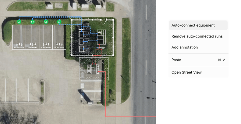
What if instead of manually drawing conduit lines you can just right click and have EVpin draw the most efficient conduit routes?
You can do that as of today. Add your equipment, right-click, and watch it create conduit lines for you. Once the lines are drawn, you can still remove or move them anywhere you want.
We also brought Google Street View into Design Mode. Right-click on the map in the area you want to view, and EVpin pulls up the most recent Street View for that exact location.
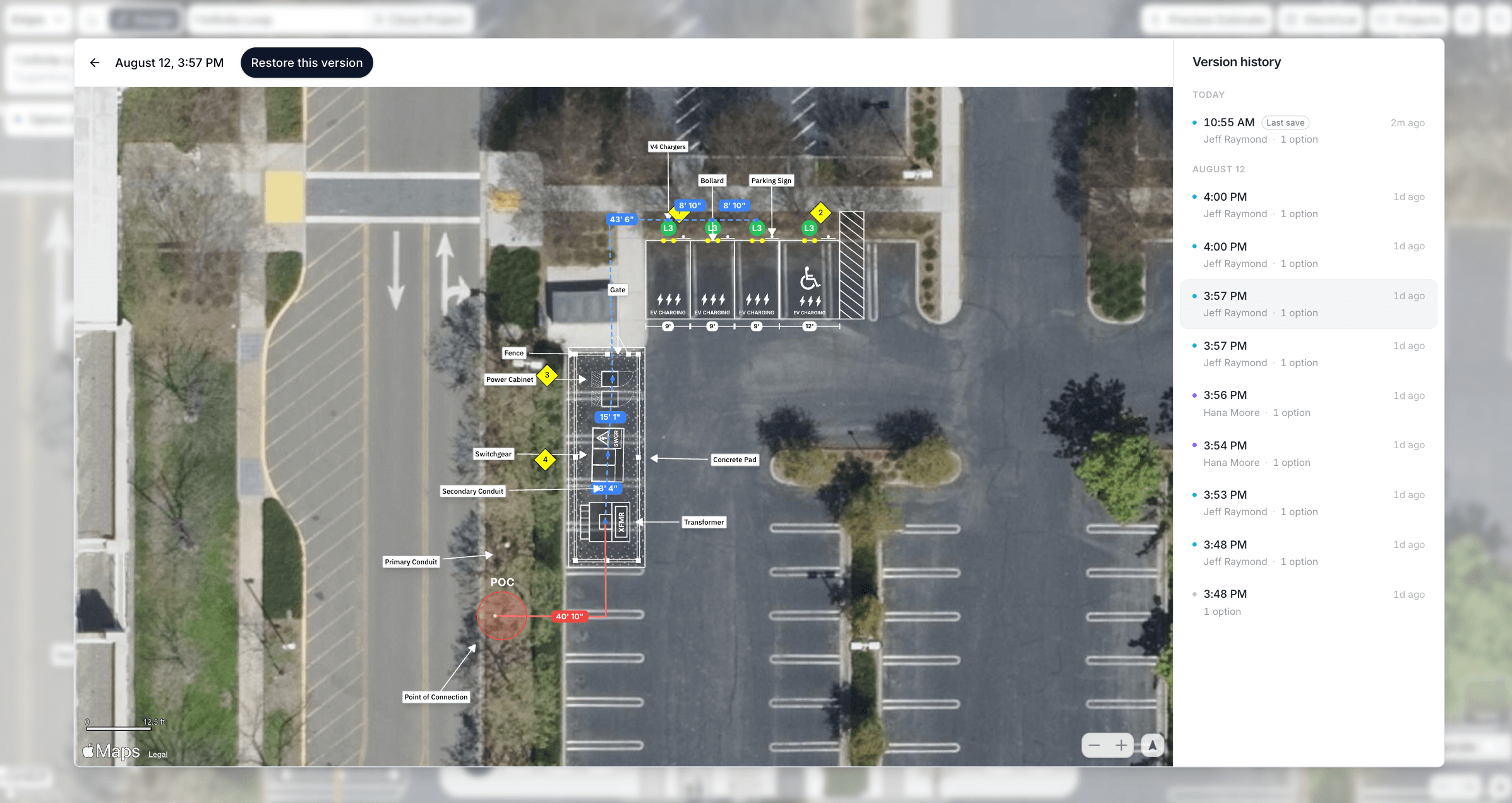
It's now easier than ever for your team to track changes, review past work, and restore any previous version of a project.
It works a lot like version history in Google Docs or Google Sheets. Every time your project is saved, EVpin creates a snapshot showing when it was saved and who on your team made the changes.
This is especially useful for teams using EVpin as part of their workflow, where one person creates a report, a manager reviews it, and other team members make updates along the way.
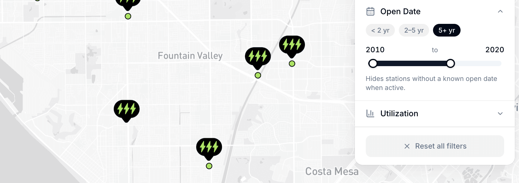
We're adding a new data enrichment to help you evaluate site performance more accurately: Station Open Dates.
You can now easily compare how recently opened stations are performing against existing ones. This makes it simpler to analyze ramp-up times to peak usage and quickly see which locations are over 5 years old.
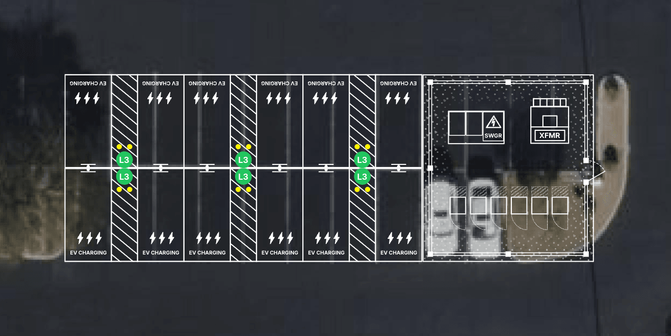
This update has a new set of design features:
- Right-click to add parking signs to your stalls
- Add a concrete pad for your support equipment
- Right-click to add a fence with a gate to your concrete pad
- Adjust the length of all stalls in one go
- The estimate keeps track of all the quantities
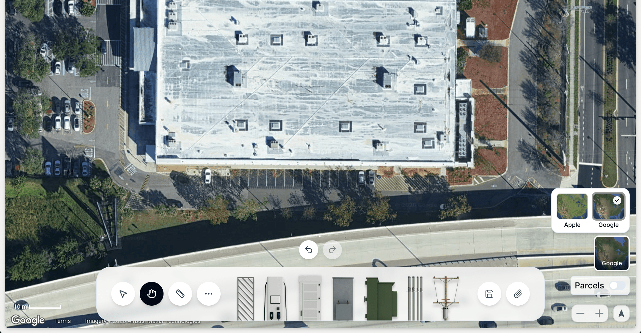
In Design Mode, you can now toggle between Apple and Google imagery before you start creating your layout. There's a new button right on the map. Click it, compare both, and choose whichever one looks sharpest and most current for your site.
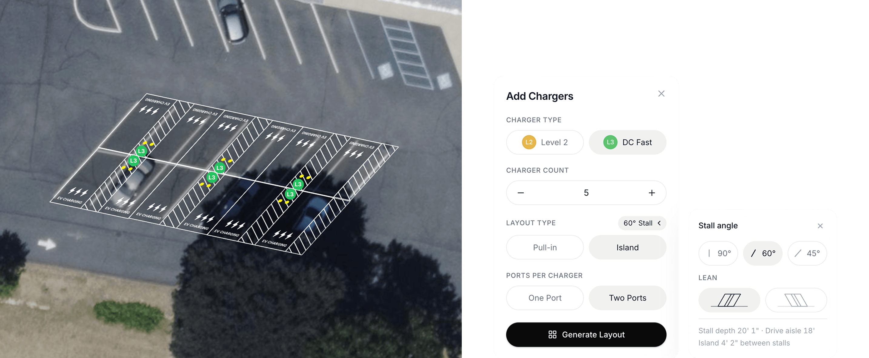
You can now add 45-degree and 60-degree stalls, not just the standard 90-degree stalls.
Fleet and L2 operators often prefer angled stalls because the shorter drive aisle width makes it easier to fit more chargers into a limited footprint.
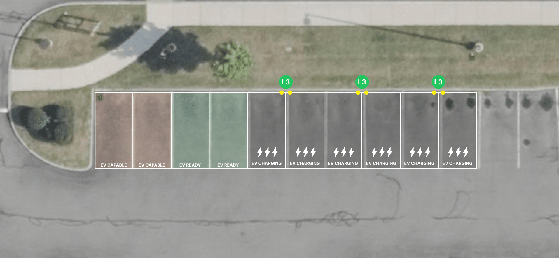
This update has a bunch of new Design Mode features:
- Add EV Ready and EV Capable stalls
- Add road markings
- Change charging stencil
- Change island width
- Draggable conduit lengths
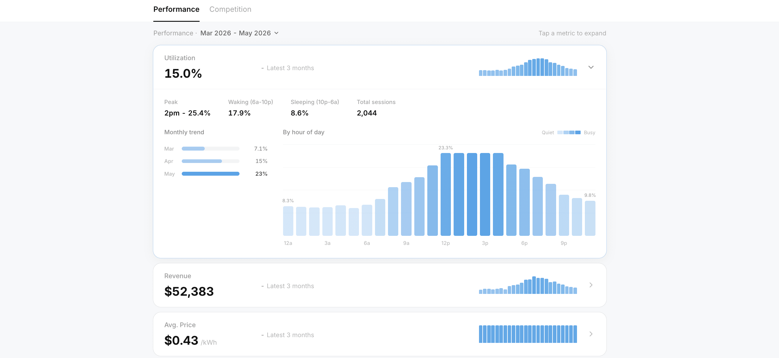
We're launching two updates that give EVpin Max users a much deeper look at station performance.
You can now view a station's three-month rolling utilization average to see whether performance is trending up or down. We've also launched a brand-new station details page where you can take a deeper look at the station's performance, usage patterns by time of day, pricing history, and nearby competition.
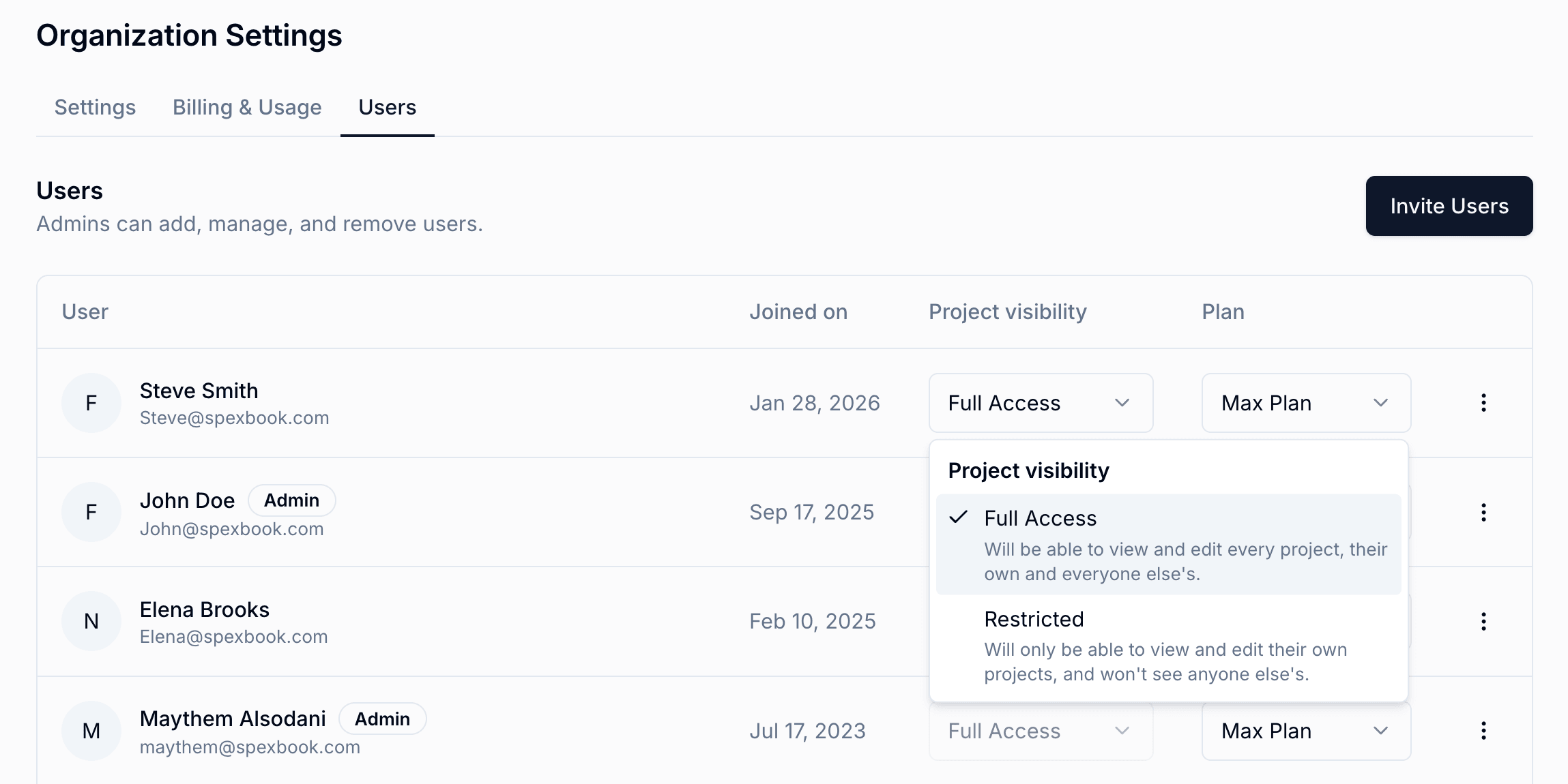
You can now give certain users Restricted Access, which means they'll only be able to view and manage their own projects. They won't be able to see anyone else's projects.
This is especially helpful for sales teams, new hires, or anyone who needs to create projects without having access to the full company book of business.
Admins and users with Full Access can still see everyone's projects.
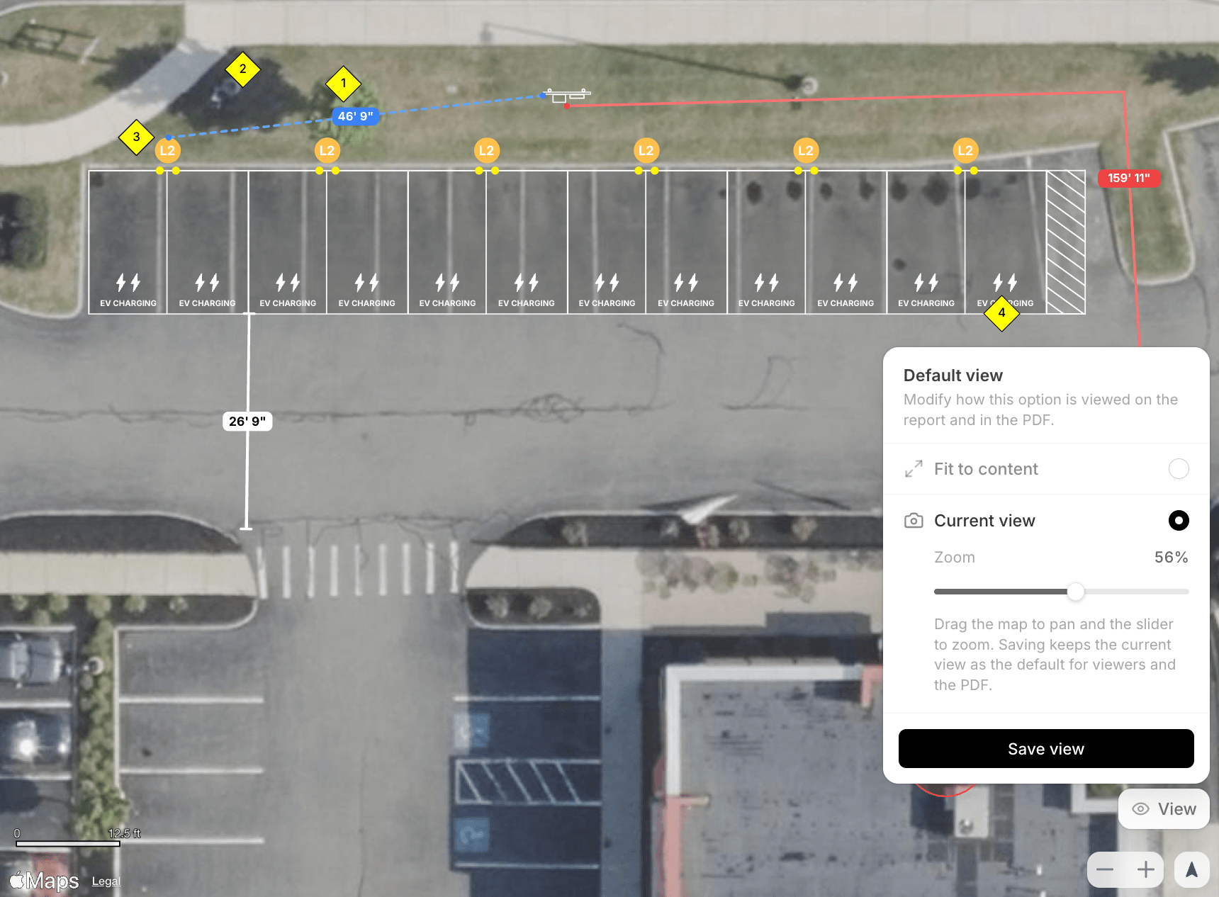
You can now set exactly how your layout appears on a report. Zoom in, pan to the part that matters, and lock in that view. However you frame it is how everyone sees it, both on the shared link and in the exported PDF.
This came straight from your requests. We've heard it more than once, and we're glad it's finally live.